How many times has this happened to you:
You design/build a WORD/PPT file with your client’s logo on the header/master page. They approve the design and pay you to receive the final working files so that they can start using the template file for all their future internal/external documents.
A few weeks go by and you get a panicked email/phone call from your client telling you that they have an important business meeting and the template file they received seems to be busted because the logo (their most precious brandy-type thing) looks very blurry.
Being one of your preferred clients, you offer to drop everything in order to check the file you built for them, but can not see the problem they are talking about.
After about 30-60 minutes of verbal freak-out on the phone, as your client is getting more-and-more certain that you aren’t the genius designer they thought you were (more likely, you are the reason they are about to lose that big account/promotion… all because of a crap file they trusted you to design for them, even thought they completely ignored your initial comments that WORD/PPT are not proper design tools… but they didn’t have the budget nor the time to invest into buying/learning InDesign or Illustrator (who uses those programs, anyway?), you ask them this one simple question: can you send me the file you are having trouble with at so I can see the problem?
You wait for the email attachment to come in… and when it does, you notice that they sent you a PDF file.
You mention this to the client, and they say “Yeah. That’s how we send our promos to our customers”. They finally tell you that everything seems fine on the template file you gave them, but the pdfs they export always end up with a blurry logo. Oh, and while they’re on this topic, they finally mention that it seems like all the infographics you created for them kinda look blurry on the pdfs too.
Sound familiar? Anybody…?
I can’t be the only designer this have ever happened to. And hopefully, it has only ever happened once before you decided to figure out how to fix it.
The first time I dealt with this, my solution was simple. I just told the client that they are exporting a low-resolution pdf by default, and this causes every embedded raster image in the Word/PPT file to get rendered at 72 ppi for the final pdf output file. They said “What does that mean?” So I showed them.
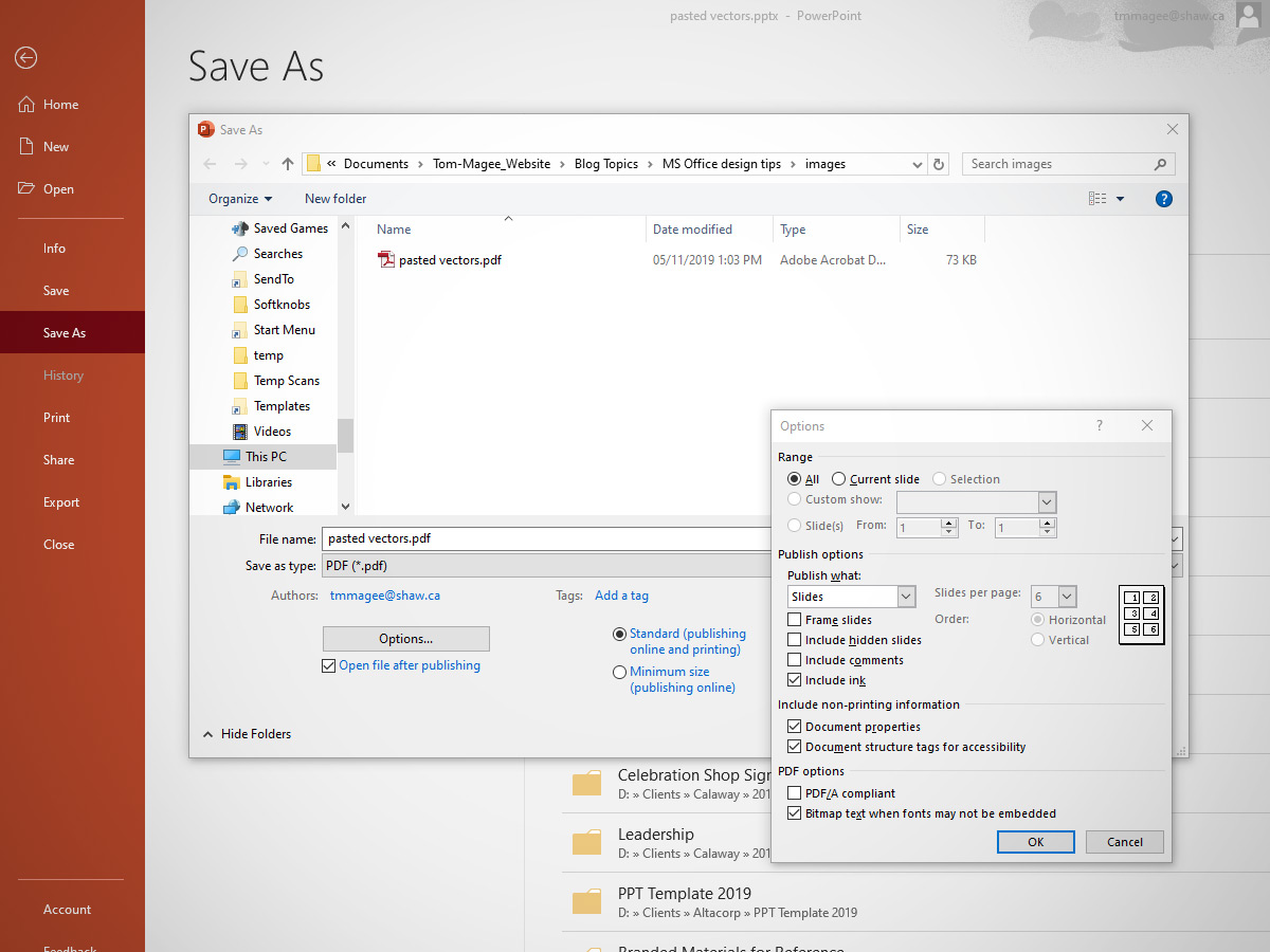
The first thing I did was explain was what a raster image is. Click that link if you wanna read my other post about that. Then I showed them the pdf settings in MS Office software. See below:
Note that there is more than one way to export a PDF from MS Office, but that none of the options give you control over image resolution on export (except for the two button options called “Standard” and “Minimum Size”). This eventually gave them the knowledge required to produce better pdfs. I made my client happy again. Of course, the resulting files were a bit bigger, but such is the price we pay for quality.
But I didn’t stop there. I actually wanted to see if there was a way to incorporate good-quality vector art into a WORD/PPT file. And I am not talking talking about importing the horrible WMF/EMF files that Microsoft keeps pushing as “the best solution since the floppy disk”. A true vector file should allow you to enlarge and reduce its dimensions without risking any image degradation. We’ve all seen logos on the sides of planes and trucks, right? Those are a perfect example of how a proper vector file can be enlarged for all sorts of professional print applications.
After searching the internet and not really finding any satisfactory solution, I finally figured it out on my own. So follow along and you too can be your client’s graphic hero.
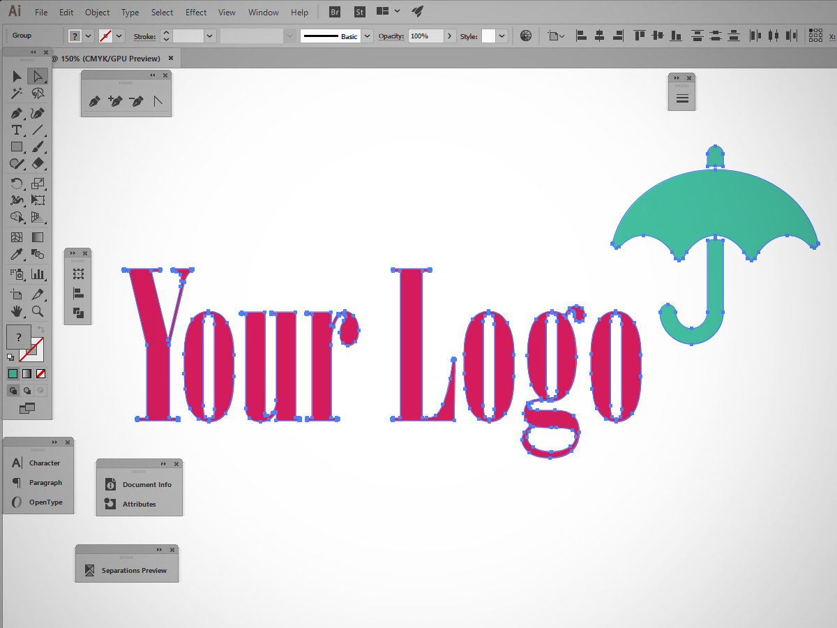
Step 1: Open the vector file in Adobe Illustrator on a PC (you can try doing this all using Affinity Designer or Corel Draw, but I can’t be certain the results will be the same). I regret to say that the MAC version of Office does not allow the clean importation of vectors into MS Office. This is the one and only time I have to say “Don’t use a Mac!!” Sucks, but that’s the way it is for now.
Step 2: copy (ctrl-c) the vectors completely onto the pasteboard.
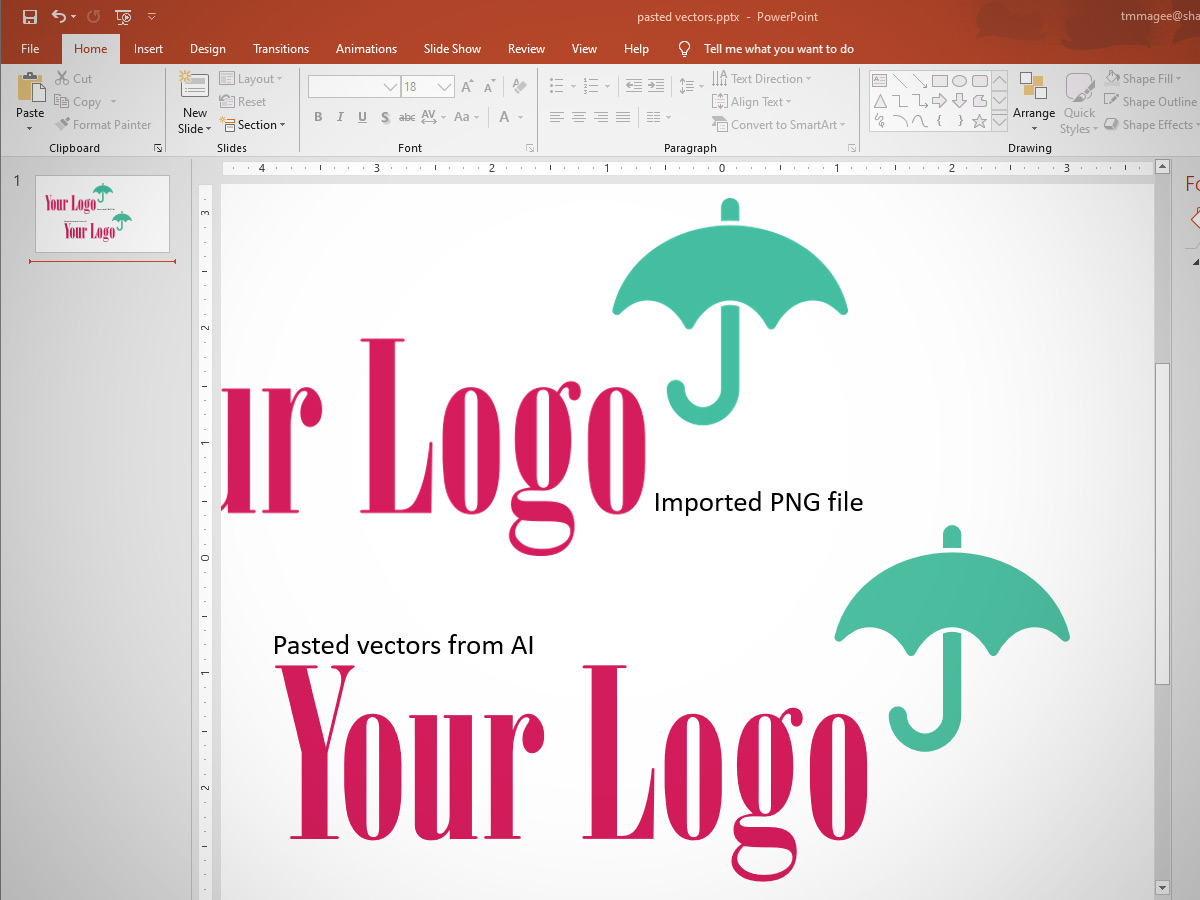
Step 3: Open a WORD/PPT file and paste (ctrl-v) the vectors.
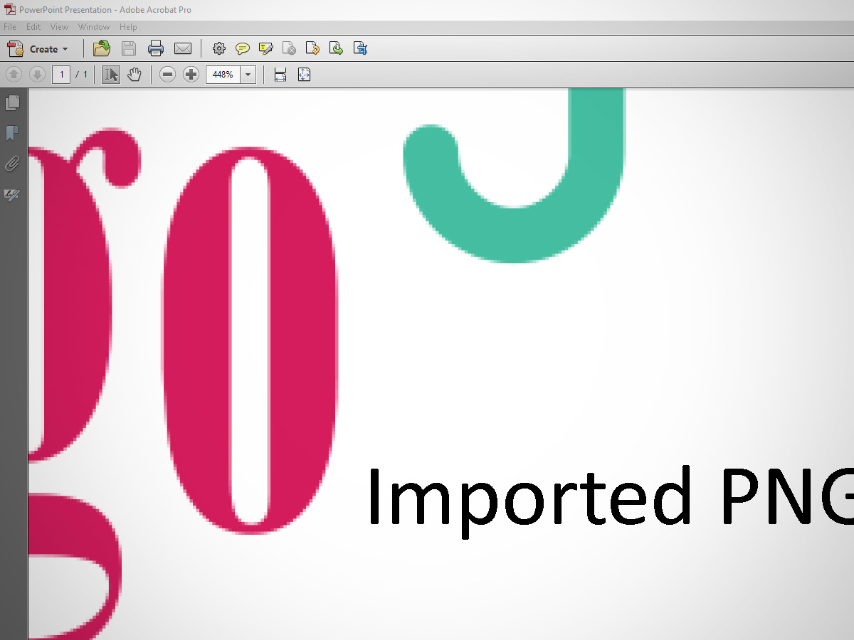
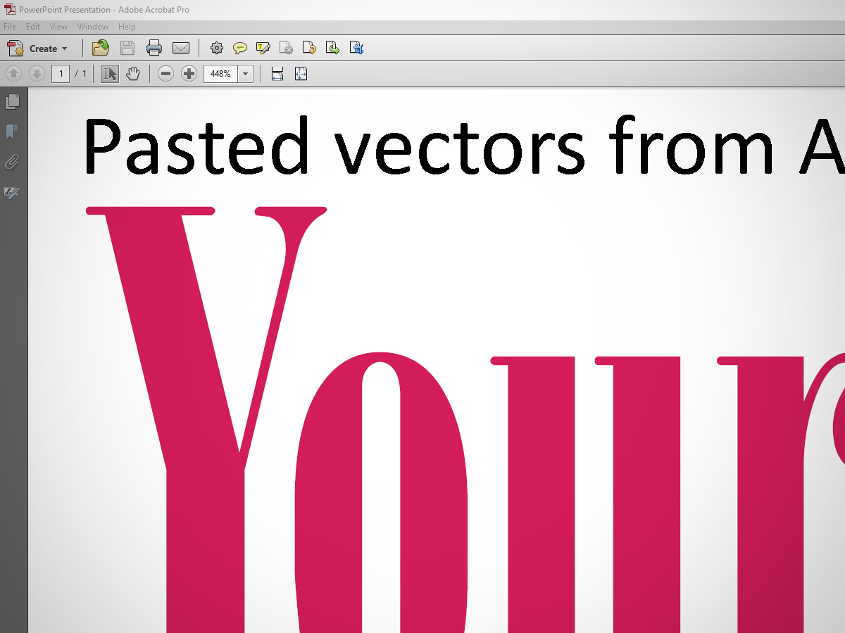
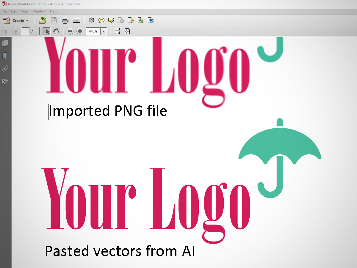
(Note: I exported a huge PNG file from Illustrator and imported that into PPT, just so that you can see the difference between the two image files. In the next two screens, you will see the final pdf exported using “Standard” setting, which microsoft says is good enough for pro printing.)
Can you see the difference now?
Here’s what it looks like when you shrink the logo down to a “normal” size for use on something like your letterhead.
Step 4: That’s about it. Now your vectors won’t get down-sampled every time you (or somebody else) makes a pdf. And your company can look its best, every time.
Update: There are a few limitations when copying/pasting vectors from AI to WORD/PPT. The main one that I know of is that colour blends/gradients/special effects do not translate well from AI to WORD/PPT. But, as is with all software, things might change with the next update So approach this copy-paste trick with fingers-crossed and know that the best thing you can do is try and ALWAYS be ready to adapt when they change the rules again, because they will.
Here’s one more nugget of hard-earned wisdom: Save your files often and do not overwrite the last working file ever. ;^)




Leave A Comment