Being a professional designer, I sometimes get to work with clients who have been operating for a while, but have a desperate need to improve their brand and corporate appearance. Until they contacted me, they may have been getting by without investing much into their marketing or communications budget. But now they have decided it’s time to actually let someone who knows a pica from a pixel manage their visual communication strategy and appearance.
A key objective of mine is to improve their level of professionalism in print and online. As I begin designing for them, part of my initial requirements is to get their best logo file format.
Nine times out of ten, they will tell me to go get it from their website or they’ll send me a GIF, JPG or PNG file from their archives. The other one out of ten times, they’ll send me a WORD/PPT doc with their logo image plunked into it. Then I have to call them and say “Thanks, but that’s not good enough.” I can hear some of you saying “But why can’t I use the logo GIF file I copied from the website my neighbour’s nephew did for me?”
To understand why you can’t, you need to understand the basics of graphic image file formats. There are two file types used in professional design: Raster and Vector images.
A raster image is built using pixels (squares) arranged in a x-y grid to display an image. Each pixel has a colour. The higher the number of pixels, the better the detail of the image (defined as “image resolution”). Raster images are primarily used with digital photos and scans. Photoshop is referred to as a raster image editing program.
A vector image is built using mathematically generated line and curve paths (vectors). Using the vector numbers, the object shapes within the image are defined and coloured (specifically, the shape outline and fill). The resolution of a vector image is defined by the software and the output device being used to produce the image. Vectors are best used to render objects that are drawn or illustrated. Adobe Illustrator and Corel Draw have the ability to edit vector images.
Ok, so what does that mean? The major difference between these two file types is most evident when you try to enlarge them. That’s when “resolution” becomes important. If you try to enlarge a raster image above its optimal resolution, the images begins to get blurry (pixelated) as the eye begins to see the original pixels made larger. However, digital image scaling does something to deal with this pixel enlargement: as the image gets larger, each original pixel is recreated using a varying set of “in-between” pixels. This is known as “digital image interpolation” and that is why raster images tend to look blurry when reproduced at sizes larger than optimal. I’ll explain it another way. When you blow a photograph up, it becomes blurry, because it is impossible to reproduce image information that was never there to begin with. AI software tools have been improving to help us deal with low-resolution images, but it is still a bit of a dice-throw to count on AI as a magic-bullet.
Vector images, by contrast, retain their original clarity and sharpness regardless of size, since the mathematical formulas (used to define the anchor points and the lines between) dictate how the image is rendered at any size. If there’s one thing I know, math is math… the results are consistent and reliable, unless you wanna get into Quantum entanglement discussions.
Whenever possible, use vector graphics for your company logo whenever you intend to reproduce it on paper, shirts, trucks, billboards, etc.
Here’s why. A logo is the most important graphic any company owns. It gets used every time the company publishes a document or puts out an ad to the public. It gets used at sizes as large as a bus. You should never see your logo rendered at a quality less than the original was designed at. You need to have a vector version of your logo in order to make that happen.
So when you are asked to supply your company logo to a designer or third-party printer, you just need to know what you’re sending.
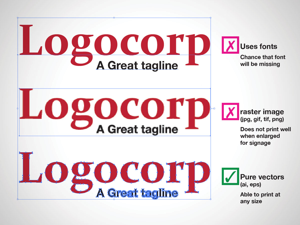
Here’s a simple visual based on a fictional company. Actually, I hope they’re fictional, because I would NOT want to work with a company named “Logocorp”. Kinda reminds me of the SCTV skit featuring Rick Moranis.
The graphic is a quick guide to check how safely your logo will reproduce. The top example is still a vector file, but it is using a font. When fonts are referenced in a logo file, there is a small chance that the person who uses it next might not have the proper font installed to faithfully reproduce your logo. Using substitute fonts is just as bad as using a raster version of a logo.
How do you know if the file you are sending is a proper vector file? The filename extension is a good clue, but that can still be misleading. Some people, when asked for a vector file, will simply rename their .jpg file to .eps or .pdf, thinking that’s all they have do to. Big mistake. Renaming the file extension does nothing to change the basic file format. To paraphrase Led Zeppelin, “The pixels remain the same”.
You will need to preview the file within a proper vector editing program, such as Illustrator, Affinity or Corel. When you have the file open, simply select the objects on screen and you should see a whole bunch of little points that flow around the object. These are the vector anchor points (some people call them nodes). If all you get is a simple rectangle around the objects, then you are probably dealing with a raster image.
If you don’t have vector editing software, then I recommend asking your designer to confirm the file structure for you. Better yet, just let your designer send the right file(s) to the printer on your behalf. Less hassle for you. And you know the job’s handled properly the first time.


[…] first thing I did was explain was what a raster image is. Click that link if you wanna read my other post about that. Then I showed them the pdf settings in […]